Howdy, y'all!
New friend and co-worker Joel Doucet has recently completed a list of his top five most anticipated and top five least anticipated movies for the rest of the year. I've been challenged to do the same. THUSLY:
Top 5 Least Anticipated Movies:
5. G.I. Joe
Rumors of it being the worst movie ever made by Paramount aside, this movie looks like it's going to be a lame duck at best. This movie was only made now becase Hasbro enjoyed such a success with Transformers. I'll probably see it, but much in the same vein I saw Dragoball Evolution - to make fun of it.
4. Ice Age: Dawn of the Dinosaurs
Why can't the Ice Age movie series just go exticnt already? The first one as mediocre and best. Scrat became redundant years ago.
3. G-Force
Secret agent rodents, all with stereotyped personalities dropping tired cultural references. That is all.
2. The Proposal
Another lame romantic comedy where two people who dislike each other find themselves being stuck together through "hilarious" circumstances. Spoiler alert! They start falling in love, will have a fight, make up, and get married, thus propagating the nuclear family for another generation. Yay.
1. Alvin and the Chipmunks: The Squeakuel
This....is just a sin against man. NO.
Check in for Part 2: MOST Anticipated movies later this afternoon. Peace out!
-Silent G
Saturday, June 13, 2009
Monday, April 20, 2009
Swedile at the Movies: Dragonball Evolution

In 2000, X-Men hit the silver screen, starting the Golden Age of Comic Book Movies. But now, with popular superheroes starting to run out, and with Ant-Man dreadfully looming on the horizon, Hollywood seems to be trying to branch out into other adaptation films. With the release of last year's Speed Racer, the race began to start the Anime Movie genre. Not to give away the ending of my much-belated Speed Racer review, but I felt that as a movie trying to be an adaptation of an anime, it succeeded where it needed to, and it probably helped that the anime in question was steeped with Western concepts and tropes. I enjoyed the movie and felt it was a step in the right direction. Then Fox got Dragonball. I saw the Dragonball Evolution movie the other day, and is it the breakout film in the anime genre?
....huh, well. Let's get cracking. As always, my Batman & Robin Movie Gradation Scale shall be used as my meterstick.
Story/Adaptation:
2000 years ago, the alien Piccolo and his minion Oozaru decended upon the Earth to reap its benefits and raze its populations. However, mystics banded together to seal Piccolo away. It's present day, and highschooler (*ack!*) Goku just turned 18, and recieves an ancient relic known as a Dragonball from his grandfather. However, Piccolo escapes from his prison (somehow...), and now seeks all seven Dragonballs so that he can summon the dragon Shenlong to grant him one wish; the power to enslave mankind. Goku, along with the hermit Master Roshi, bandit Yamcha, and PhD in...tactical weaponry Bulma, travel across the globe to prevent Piccolo from ressurecting Oozaru.
Umm....yeah. Wow. Before I go on, I want to stress that I am not a huge Dragonball fanboy. I watched it as a kid, and I enjoyed it for what it was, but it was not among my all-time favorite things. As such, know that this review does not come from the perspective of one who's childhood had been raped (unlike the people I went to the film with). This is a review from the perspective of just going to watch an adaptation with no real expectations. That said, this story was shit. It was entirely derivative and largely pointless. The producers of this movie took something pretty original, and turned it into your average hollywood action buster with some vague threat to meet at the end of the movie, and hollow character relationships that struggle to make you care.
To talk specifically about their success at adapting the source material, I'll say that the result was.....conflicted. At times, they did things that sort've surprised me. Little fan nods that only the fans would care about, like referring to Goku as "Son Goku" (his Japanese name) at one point, or showing that Roshi kept a collection of ladies underwear catalogues. This sort of stuff was thrown in to appease longtime fans, I'm sure. Then you've got your basic elements; the Dragonballs, Namekians, Capsule Corp., all the basic stuff that really need to be in a Dragonball adaptation.
However, these little nods often butt horns with the other interests of the movie makers, namely appealing to demographics. Instead of being a socially oblivious little boy, Goku's an awkward teenager with angst and girl troubles. He goes to parties lifted right out of The OC. Yamcha sounds like a surfer. In a better film, the director, writers, and other crew members working together cohesively might have been able to merge the geek and the contemporary and have it flow and make sense and feel, if not right, then at least believable. But in DBE, the two fight for screentime to the detriment of the movie. Never once does the movie feel like it's in agreement with itself, which is ironic, considering how much Goku rambles on about being at one with the two halves of himself (BIG SPOILER GOKU IS OOZARU WHO COULD HAVE SEEN THAT COMING DERP).
Speaking of Goku being, Oozaru, they don't explain anything in this movie. Piccolo's just....out and about at the beginning of the movie. This is fine, they'll just explain later, I thought. It might have been an interesting plot twi---oh right, the movie needs a plot to have plot twists. As it turns out, it's never explained how he gets out. Nor is it explained how Piccolo's servant Mai can shapeshift...or even who the hell she is. Where the hell did she come from? Was she trapped with him, or did he recruit her? Did she break him out? Nothing at all is explained. Goku's history and the Oozaru thing is equally vague. Was the original Oozaru Goku? Was it an ancestor? Is Oozaru some spirit that overtakes Saiyans (they did say Goku fell from the stars in a meteor)? It's all just very muddled. They often don't attempt to explain anything, and what they did attempt to explain was so befuddling it would have been better left to my fertile imagination.
The one bit of adaptation I actually liked was what they did with Roshi's house. In the anime/manga, he has a little house on a tiny island in the middle of the ocean. In the movie, he lived in an old tennament building on a tiny island, where all around has been dug out an excavated, and surrounding that is a giant city. That was pretty evocative of the old house without being a direct translation, and I liked it. The only thing that would have been better is if someone graffito-tagged "Kame House" on the front. That would have been excellent. But other than that, huge flop in both story and adaptation departments. The characters were lifeless, dull, and often entirely unlike their inspirations, and the story was confusing in the way that elements felt missing and other elements were thrown in at the last second. Epic fail.
Casting:
Wow. Just, so bad. There were three halfway decent people in this movie; Chow Yun-Fat as Master Roshi, James Marsters as Piccolo, and believe it or not, Justin Chatwin as Goku. Allow me to explain further.
Chow Yun-Fat, for his part, seemed like the only fully-realized character in the movie at all. As much as he didn't look like him, he sort of acted like Master Roshi; a skilled master as well as a perverted old man with quirks. He had moments, however brief, of gravitas. It wasn't an Oscar-worthy performance, but it was at least a performance.
Marster's Piccolo had no overt faults on his part; he was the traditional chilling, heartless villain. His major flaw was that he was barely in the movie at all. He needed more lines, more screentime. I feel he could have done better. He was still a little hammier than I would have liked, but it was not cringe-worthy overall.
As for Goku, my problem with Goku was in how he was written. He was the generic, blank hero from every lame Hollywood action movie. There were moments, however brief, of the Goku we know and love, and I got from Chatwin that had the movie been written with that personality in mind, he could have performed. However, he was asked to be a lame dork with angst and cold feet around girls and just being the average movie teenager, and to that degree, he delivered. I just feel that, were he asked to play, you know, Goku, he could have delivered there too.
And that's all I have to say. The rest of the cast read like they were reading lines translated by Babel Fish.
Special Effects:
Decent. Nothing really exciting, nothing disappointing. Slight Shakey-Cam Syndrome, but not enough to annoy me. The one effect I actually liked were the Dragonballs themselves. I liked how the stars in the center floated around a foggy interior. It was a neat effect. That is all.
Music:
N/A (that is to say, not worth my time)
Product Placement:
Actually, none that I noticed. Surprising, being a Fox movie. Ironically, they did stuff in the movie like they were doing product placement, but with non-existant products (ie Capsule Corp, and some...retro Robot or something). This was kind of interesting, and yet at the same time, it makes me feel sick, because even non-products get product placement in a Fox movie.
Humor:
I don't know, the movie was pretty funny. On, you know, a schadenfreude level. Their actual attempts at humor failed. Except Roshi sneaking a grab of Bulma's ass. I think I laughed then. Maybe. And only then because it was a reference.
Direction:
James Wong failed on pretty much every level. I couldn't follow the plot, what I could follow was boring, I didn't care about the characters, and the film felt decidedly nothing like a Dragonball movie. It was Dragonball on a cosmetic level only. This has got to be the shortest "Director" section of any of my movie reviews, because there's nothing good enough or bad enough to go in-depth about. It was merely average; lazy and hackneyed as always. Thanks, Fox, for setting the bar so low.
FINAL SCORE:
3/4 - An overall bad, useless movie, with a few saving graces.
Yeah, not a 4/4. There were some things I liked. Like I said, Chow Yun-Fat's performance was ok, there were some fanwanks that I appreciated, Kame House and the Dragonballs were adapted to the screen well, and it wasn't like it was boring or sickening. But it's largely a pointless movie. The producers clearly had no love for the property. They just saw something that was popular and thought it would make a popular movie, while at the same time gutting almost everything that made it popular in the first place. When will they learn to stop doing that? Instead of being a decent adaptation, with changes being made only for the sake of storytelling in that medium, they just add as much as they can so it can be minimally appealing to everyone while not being overly appealing to anyone.
So, is this the start of a wave of Anime movies? Well, with the news that Keanu Reeves will be playing Spike in an upcoming Cowboy Bebop movie, as well as the Evangelion movie being in development hell, it seems that it'll be the thing that tinsel town tries to make the next big thing, while not really appreciating the material at all. Well, we'll see anyway. I personally hold out hope that at least a few good movies can be made (Evangelion looks like it's struggling to the surface with the constant efforts of people who truly seem to love the source material). But if this is the "evolution" of the anime movie genre, I'll stick to reading backwards, thank you.
As for me, I'm off to find 7 mystic orbs to wish for...Spider Powers. Yeah, I wouldn't even wish this movie better.
- Silent G
Wednesday, April 1, 2009
Swedile at the Movies: Watchmen
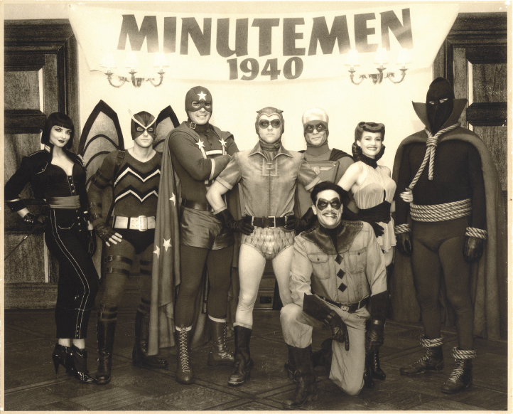
Silent G's journal, April 1st, 2009:
This city's afraid of my reviews. I've seen it's true face. Saw Watchmen twice to make sure. Zack Snyder possible communist? Must remember investigate later.
Batman & Robin Gradation Scale as always.
Story:
In an alternate history where superheroes exist and have been subsequently outlawed, Edward "The Comedian" Blake is murdered in cold blood. Fellow masked vigilante Rorschach, who's become completely psychotic over the years, investigates his murder and is positive that a "Mask Killer" is going around. He warns his fellow superheroes Nite-Owl/Dan Dreiberg, Silk Spectre/Laurie Juspeczyk, Ozymandias/Adrian Veidt and Dr.Manhattan/Jon Osterman, but they're all too concerned with mounting political pressures boiling over in the Cold War. As the plot develops, we find out what sort of people would really become superheroes, how their presence would affect world events, and ultimately discover a plot far more disturbing than a simple mask killer.
I'll get into more of this when I hash out the "Adaptation" section, but that's basically the story.
Casting:
Not bad, overall. Jackie Earl Haley as Rorschach was pretty damn inspired. He looks like the guy, he sounds like we all imagine he sounded, and he plays the part mostly well. My only gripe here is he didn't seem as detached as he does in the book, but it's a minor disappointment. He makes up for it whenever Rorschach freaks out. Creepy.
I also really liked Patrick Wilson as Dan. Other people were less impressed by him, but I felt he captured perfectly that 80's nice guy I'd always imagined and then some. He was the heart of the film, and he did the character proud.
Malin Akerman as Laurie was easily the weakest link in this group. I wouldn't say she was bad at it per se, but she had the challenge of playing Laurie, who came off as very three-dimensional in the book. In the movie, she was just...there. How she got top billing is beyond me.
Jeffrey Dean Morgan as The Comedian was excellent. He brought the character to life for me. He's such a depraved asshole who you really feel bad for by the end of the film. Easily one of the best performances of the movie.
Billy Crudup as Jon was...slightly mixed. I think he did a good job of portraying this person who really has no connection with people, maybe even too good. But it felt hollow at times. I don't think the film explained as well the little things about Jon that make him matter. But also, often times he was downright chilling how inhumanly he reacted. Not a bad performance, it just faultered in places that may not have been his fault.
Oh, Adrian. Adrian, Adrian, Adrian. Played by Matthew Goode, he was the least interesting of the main cast, which is a shame. Ozymandias has this gravity to him that I wish had been translated over better. I think Goode deciding to give him a German accent was far too cliche for most of us. I will give the guy props, however, during the ending; he kicked ass. The movie really pulled off the way the comics showed how flippin' fast his is well with the use of the Snyder Slo Mo. He also had some good speaking moments in this last act, but a lot of it was still cliche. Really the only part I think was ill-cast. Jude Law would have been great here.
Everyone else was mediocre to bad. Carla Gugino's Sally Jupiter was depressingly bad. Her character is one of the many emotional anchors to the book, and her final scene was touching. Here, she was just a lush, and even the final scene was hammed up. Stephen McHattie's Hollis Mason was decent, though. Can't wait to see more of him in July. I also liked Matt Frewer as Moloch. Slightly goofy, but that's probably how he was ment to be in the book, I could never tell reading it. And just everyone else was mostly meh.
Music (Both Score and Soundtrack):
Score first. It was bloody perfect. Tyler Bates really channeled the scores from 80's movies like Blade Runner, Taxi Driver, and other similar films. It made me feel like I was watching a movie made in the 80's at times, which is just perfect. Absolutely awesome (though admittedly, some pieces were a bit dull).
As for the soundtrack, which consists of period-accurate songs, a lot of people have given it hate (with the exception of Bob Dylan's "The Times They Are-A Changin'" used during the opening sequence, that was universally loved, myself being no exception). The complaint is that a lot of them felt out of place for the scenes. I didn't feel this. I barely noticed. The ones I did notice seemed appropriate to me. About the one I had issue with was Leonard Cohen's "Hallelujah" used during the sex scene, and that's mostly because they had the perfect chance to use "You're my Thrill" and they didn't. The soundtrack was good, and I rarely say that.
Special Effects:
Pretty good. Jon was really the main factor here, being made by having Crudup wear a suit that recorded his movements, and put those movements and a digital scan of his face onto a digital skeleton. This had it's really really good moments, and it's bad moments. Sometimes he looked like an actual person, and others he looked like he belonged in Shrek. Still, the times they succeeded were incredible. It seems to me a case of just needing more time to touch up on post production. It succeeded in mostly not seeming like CGI, so I say kudos over all.
The other stuff was ok. Rorschach's mask was cool. Archie the Owlship looked appropriate. Bubastis looked kind've CGish all the way through, but she was in the film so briefly it really didn't matter. Mars looked cool, but there's not much more for special effects to be said, really. If you're the type who goes to movies for their effects, I doubt you'll be disappointed.
Adaptation:
This is the big one. Was it adapted the way all the comic book fans wanted it to be adapted? Or was the general public pandered to once again? Well, you know what? On the whole, I'd say they were pretty damn faithful. All of us fans who sat hoping for a panel-by-panel direct translation were, I now realize, being unrealistic. I mean, I never truly expected it, but I had hoped. But looking at it now, some changes they made were okay for the medium of film, and did not detract from the feel of Watchmen. And there were certainly examples of shots taken perfectly from the book (I giggled when they perfectly reproduced the first page of the book). Some things were omitted, and some things were explained more in-depth or made fact where the book only hinted. And I'm cool with that. While I would have loved to see Max Shea or Rorschach's landlady or the "Crime Busters" or the Squid, I think that for the most part, the film still captured that true Watchmen essence.
That is, until Adrian said he did it 35 minutes ago.
I had real problems with the ending. And not the problem I thought I'd have, with the engineered "alien" monster being replaced with a machine that mimics Manhattan's powers. The way they explained why that would bring countries together sort've kind've made sense. Not as much as the squid made sense to me, but enough that I could move on. My problems were with the little cosmetic changes that made the ending feel very Hollywood, where the whole movie sturggled to be so un-Hollywood. Someone had to see Rorschach die and go "NOOOOOOOOOOOOOO!" Someone had to hit Adrian and give him a stern talking to and a glare as they walked away. Manhattan had to kiss the girl on his way out (THAT was random).
Just in general, the whole moral defeat of the book is just gone in this version. Snyder promised the same "Moral Checkmate" of the original ending applied, but it did so only on face value. You don't feel like the characters feel like they're morally oblidged. They're just oblidged for some reason. And taking away Jon's final line of "Nothing ever ends" from him and giving it to Laurie was downright criminal. That line was so chilling, and it's what gave Veidt second thoughts. In the film, it's just Dan yelling at him that does that. The whole thing is reworked in such a way that basically all the same things happen, the same things are said, but it's made palpable to the Hollywood execs that believe making people think will affect their bottom line. And that to me is just sad.
But I will say this; it could have been a total write-off. They could have made this movie 5 years ago, and if they used the script they had for that stage of production, I wouldn't have even gone to see this movie at all. So props must go out to the men and women who took a risk on something so different, and keeping it true for the most part. It's just a shame they fumbled in the final quarter.
Direction:
And the person at least a great deal responsible for the ballsy-ness of this film is Zack Snyder. He says he's a fan, and it certainly shows. There was much love put into this movie, this adaptation, and I know a lot of his changes were made from two vantage points: one of a filmmaker trying to make sure that the property works as a film while still staying as true as possible to the original source, and the other of a filmmaker who has to appease his producers, who are putting the money in for this, and who want to make sure that the film will appeal to many people. Considering that he had to deal with all of that and made a film I am happy to call a "Watchmen" adaptation? I'd say he succeeded on a pretty profound level.
My one complaint with him is he seemed to want to amp everything up, where the book might have been more subtle. In some places this was cool. Adding some screen time to a prison fight is nothing to complain about. But at other times it felt strained or out of place. The sex scene on Archie was uncomfortably long. The fight with the Knot Tops consisted of things like punching a guy's bone through is arm and stabbing another in the jugular. Stuff like this that was overdone just a tad too much made me feel like Snyder was a kid playing with this awesome toy, and just going wild with it. But again, these complaints were pretty small, inna final analysis.
FINAL SCORE:
1/4 - A damn good movie with one or more flaws too glaring to make it perfect.
Yeah, as much as it pains me to do so, I really have to give it a 1/4 for now. There's my problem with the ending, which I explained in depth above. But there's also the human element that was missing. The whole movie was about superheros and their lives, and we barely see the people on the street. In the book, we see their lives, their trials and tribulations unfold, and it makes it all the more sad when they're all killed in the blink of an eye. It just made the movie feel kind've hollow. I never once expected the movie to rival or exceed the book; the book is a work of art. But I had hoped the movie would do it's best to portray the human element so present in the original work. In this cut, the movie sort've fell flat. That, combined with the ending, has produced this score.
However, all is not lost.
This cut is merely the theatrical cut of the film, the one shaved down so it would hit the more palatable 2h30m mark. The actual cut is actually close to 3 hours, and this cut will be released on DVD. I am very excited for this version to be released. Most of what was cut was Bernie and Bernard, as well as Hollis's murder, and all the other human scenes I missed. There's also even a super duper cut in the works that will incorporate the animated Black Freighter film recently released. So, dear reader, expect an update review in the coming months, because I WILL be reviewing these other cuts separately from this one. I'm hoping that it will stack up better than this one, because Watchmen, on a moral level at least, truly deserves a 0/4.
This one's for you, Alan!
- Silent G
Sunday, January 4, 2009
Swedile at the Movies: The Day the Earth Stood Still (2008)

These days it seems I’ve been watching nothing but remakes, reboots or adaptations. And say what you will about Hollywood losing all creativity, and I may even be inclined to agree; it would be nice to see something completely original that turned out to be awesome. However, on the other end of that spectrum, I love the idea of remakes; there’s a certain sense of expectation coupled with new technology, new filmmaking techniques and schools of thought, and classic tropes that add sort of an epic quality to certain scenes. When King Kong took to the Empire State Building in the 2005 remake (a very good, if a very long, movie), we all got collective chills. This sort of experience redeems the concept of the remake as far as I’m concerned.
Does that mean that I like all remakes? It certainly does not. Most remakes are done for the sake of remakes, and either fall short of the original motion picture, or change too much, or miss the point, or just plain suck. Is this the case with the recent remake of the Sci-Fi classic, The Day the Earth Stood Still? Follow along as I dissect where this movie wins, fails, or just plain changes for no real reason.
As always, my Batman & Robin Gradation Scale applies.
Story
We suck, apparently. Klaatu, an alien representative of a group of mighty space civilizations, comes to Earth to give us our final warning about our self-destructive, wasteful ways. Seeing as we treat the powerful alien and his giant robot companion G.O.R.T. with fear and Air-to-Land Missiles, he decides we’re not worth his time and initiates a doomsday process to kill us off before we kill the environment. It’s left up to astrobiologist Helen Benson and her unimaginably cynical stepson Jacob to convince Klaatu we’re not so bad.
Any Science Fiction buffs reading this will undoubtedly pick up on the difference between this film and the classic 1951 version. The original film had a very anti-war message, with Klaatu visiting us not to keep us from killing the Earth with our gasoline and our Red Bulls, but rather to keep us from pointing our brand-spanking new nukes up into the stars. Much like the original film was a response to Cold War tensions at their height, this film is a response to the ever-increasing threat of Global Warming. I really don’t mind this. It’s better and more believable than making it focus on something like the “war” on “terror,” which has been too prevalent in our media of late. The war message made sense back in the 50s, especially with the advent of nuclear weapons. It would be hard to make that message contemporary today. I feel for the people who complain that this takes on a more “green” message than it’s predecessor, but if you like the war stuff, watch the original. As far as making this movie feel contemporary with us facing a legitimate threat, this film basically succeeds.
I also like the ending moreso than the original *ducks as a glass bottle is hurled at him*. The original is classic, and it truly said something about the mentality of the time and what the filmmakers felt needed to be done to prevent us from blowing up the world, but from a purely cinematic and narrative standpoint, it’s somewhat anticlimactic. Klaatu takes the whole movie to tell us if we don’t behave, robots will kill us. In this new film, Klaatu gives us no such warning. He is planning to exterminate us. And even though the day is saved (of course it was, it’s Hollywood), he leaves the world in such a way that it would have massive implications on our society. This film actually makes humanity suffer some consequence for its actions. I think this works better as the ending to an alien invasion/extermination story. Though I must admit that this, too, was executed somewhat anticlimactically. Still, I’d say the story is fairly solid; it retains enough of the original while also being somewhat new, fresh, and believable to a certain degree.
Acting
I must say, Keanu Reeves was an inspired choice to play Klaatu. While his deadpan style of (or, as some would say, lack of) acting in most movie roles make him seem wooden and untalented, it works to his favor when he’s playing an alien sent to examine Earth on a logical and utilitarian level. He’s perfect, and the movie wouldn’t have been anywhere near as decent had he not been in it. He brings the character to life. Also, Keanu Reeves speaking Chinese in this same dreary voice was hilarious.
Kathy Bates plays one Regina Jackson, the Secretary of Defence of the United States. When I saw this character in all the previews, I thought to myself, “oh great, here’s the token bitch that’s just going to be evil for the whole movie for no real reason.” But I must admit, I was largely surprised with how subtle the character was. I mean, don’t get me wrong, she was a great big bitch. But she also clearly had a human side to her. She cared about the world and saving it, and even trusted the female lead to talk Klaatu out of killing us instead of just bombing him (that was, apparently, the unseen President’s job). She was largely unlikable as a human being and is an example of the destructive people Klaatu believes us to be, but much like he discovers in the entire human race, she has another side to her, to the point that I couldn’t consider her an antagonist. She’s a delightful surprise, guys.
John Cleese was in it, and he was great…for the five minutes of screen time he got. The hell?
Everyone else was mediocre to bad. GOD, I hated that little kid. When someone like me says, “Man, that kid’s really cynical,” they’re TOO cynical. Also, I disliked the subplot that he and Jennifer Connelly don’t get along. It was boring and entirely forgettable. Damn you Hollywood, and your useless subplots!
Special Effects
There wasn’t much in this field, what with the primary character being a humanoid in a suit. But what they did have was pretty damn good. I liked that the aliens used something non-mechanical to travel in. It’s a nice change of pace, and sort of works with their whole environmental message; their spaceships are clouds and their spacesuits are placentas. How much more carbon neutral can you get?
But the cream of the crop was Gort. I loved this guy. He’s a giant walking granite slab of kill your ass. When he first appears from out of the sphere and starts immediately ruining our shit was probably my favorite part of the movie. This thing meant business. It retained the essence of the original character (prop?) while at the same time removing all the campiness and replacing it with awesomeness. Also, this has nothing to do with the SFX, but I’m certain Klaatu uttered a gargled, alien “Klaatu Barada Nikto” to Gort in that first scene with him. Classic.
But besides this, it’s not an effects powerhouse, simply by the nature of the film. It’s got an alien swarm destroying Giants Stadium (oh no! However will society go on without Giants Stadium?*), but that’s about it. Still, the stuff they do use looks realistic and awesome enough, so you won’t be disappointed with regards to quality.
Music
Not really that good. Not bad, per se, but unmemorable. The original film had a classic 50’s Sci-Fi score. How hard would it have been to go with that? It would have been epically awesome. Or maybe they did, but Tyler Bates messed it up so bad we didn’t notice. Which is just as bad. However, the music played over the first part of the credits was cool. I just wish I could find it.
Product Placement
Noticeable, but bearable. There were just a few pointless shots of World of Warcraft and Snickers, and the film clearly had its mouth wrapped around Windows Vista’s proverbial schlong. However, I had really bad “Mac & Me” shellshock when Klaatu requested he be taken to McDonalds (“Take me to your McLeader!”). Thankfully, though, he did not don a bear suit and dance the Charleston on the countertop.
Direction
This is another one of those movies that fails to adhere to the auteur theory. I couldn’t really get a sense of the style of the director, Scott Derrickson. However, in checking Wikipedia, I see he also directed The Exorcism of Emily Rose, and I can say at least this; this film is equally as foggy. There’s never really a clear day in the whole film – it’s either raining or foggy or drab or swarming with tiny alien locusts. It’s not until the end, when the Earth is saved in more ways than one, that we really see a clear, quiet day. So I’ll give you that, Derrickson; you’ve employed a certain amount of symbolism that conveys the green message all that much more (which will make sense to you, the readers who have not yet seen it, when you see the ending yourself – so sue me for trying to be relatively spoiler-free this time!). Kudos. Also, kudos to your earlier, forgettable exorcism movie for being the stepping-stone to this realization. It had to be good for something.
Otherwise? He tells his story and it’s coherent, and while the rest of the world complains that there is no ending, I will defend you; there is an ending, it’s just terribly anticlimactic. But I get where he was coming from, so I’ll say this; his work on this was decent, and in very few moments, even chilling. Which is more than I can say for some of Fox’s recent body of work.
FINAL SCORE:
2/4 – Mediocre, with no major flaws or successes
This film, I think, is a worthy enough attempt at a remake of a classic. It doesn’t try too hard to amp up its source material or go crazy with the special effects; it mostly stays true to the overall feel of the original. It falters in a few places, but in my opinion, actually improves on some others. Overall, when I watch this, I think to myself “I’m watching a version of The Day the Earth Stood Still,” which is a basic success in my books. However, despite all this, the film is ultimately forgettable, with its cast of mostly sub-par secondary characters. It’s pretty bad when I consider the performance of Keanu Reeves one of the best in a film, even if it is because of some truly inspired casting. I still hate that kid.
The true test of this movie will be if its message will stand the test of time. According to Wikipedia, the original film was only moderately successful at the time of its release. As with all classics, it took a lot of time for it to be revered as much as it is, mostly because it said something truly poignant about its time. Will the remake fare as well? Does it speak of something equally poignant about us today? Only time will tell. I, however, will tell you that strictly from a filmmaking perspective, it’s worth a trip to the multiplex if you’re into this sort of thing. And remember, KEEP WATCHING THE SKIES!
(…oops, wrong movie)
- Silent G
*this joke was co-written by the talented Alex Colgan over at Endoscopy: The Musical (get back to writing, Al!)
Monday, December 8, 2008
Swedile in the Classroom #6 - Annotated Bibliography
1. DeviantArt
http://www.deviantart.com/
I’m starting with DeviantArt (a.k.a. “dA”) because this is the most well known art community website, with over 8,000,000 users to its name. Users have all sorts of options open to them; they can post art, journal entries, polls, comments and so on, and they can watch other artists, and DeviantArt will alert you when those artists have updated with art, journals, or comments to you. Further, you can add other people’s artwork to your “favorites” gallery, so you can always browse your favorite art.
The way the website is put together is rather simple to follow, given a little time to get used to it. One aspect that is very useful is that the menu bar up at the very top never changes or moves. From anywhere in the site, you can click to go back to the main page, or back to your individual gallery page, or browse for any given topic, and check your messages. Also, galleries are all formatted roughly the same way, so that one never has trouble finding someone’s gallery, favorites, journal, etc. Even comments are done in such a way that it’s clear who is talking to who (when you reply to a comment, your comment becomes indented over a little bit, and any comments made after that one are also indented, so keeping track of a conversation is simple). Overall, the navigation of the site is designed to be very natural and easy to use.
Lastly, the site’s overall design is very monochromatic. The colors of the site range from white to a grayish beige color. The question has been raised in class as to why do so many art-themed sites seem to be designed with very little color. I think this is a case of smart design; when the website showcases art, the site itself can’t be too colorful, or else the reader will find it difficult to tell the difference between the art and the site. When sites like DeviantArt choose a color scheme that is very drab, it’s actually a rather smart way to draw the attention to the art itself, and to make the art, navigation, and the website design separate. In as much, DeviantArt succeeds where a lot of other sites fail.
2. TegakiE
http://www.unowen.net/tegaki/index.php
TegakiE’s content differs from the majority of art community websites; instead of uploading an already-completed picture onto the site, you draw directly onto TegakiE with a tablet. This sort of interface is commonly known as ‘oekaki,’ which is the Japanese word for ‘doodle.’
In regards to website design, it suffers visually for being far too drab and simple. It’s merely a white background with Times New Roman font for the links, the only color besides the art itself are the ads. Also, the navigation is somewhat tricky in that while the menu never moves from the right hand side, the options often change depending on what kind of page you choose. This can make it very hard to navigate, especially when you’re new to the site. It gives the impression of being a very amateur website, which is a shame, because it’s really very innovative in other ways.
One major way is the way the community interacts. There’s almost no typing involved in the site; you pretty much literally draw everything. The most interesting example is the comment system. Under each finished drawing is a small canvas box that acts just like the area you draw your entries on (except smaller). People draw their comments instead of write them, and they can do pretty interesting things with this technology. Whereas on a site like DeviantArt, the art never expands or changes beyond the finished submitted piece, while here, other members can add on to the drawings, or bring a new dimension to it, or even start a narrative. Thus, TegakiE is an artist community in a much more interactive sense, where each artist can add something to any piece of art and help to create something new.
3. iScribble
http://www.iscribble.net/
iScribble is another oekaki-style website, where artists can join group drawings and all draw on the same canvas in real time. A user logs in and enters a chat room, usually with a theme like playing a certain game or drawing a certain subject, and you can chat while drawing with others at the same time. It’s a step further in the collaborative art interaction that I mentioned above. It’s like an electronic version of doodling on a fellow artist’s sketchbook.
Sadly, as much as the content of iScribble is amazing, the website design is proportionally awful. The home page is a wall of text with little icons and ads and a list of users currently online. The link to enter the site is hidden in this text near the top of the page. This first click leads to a login page, where you log in and then click to go forward, and assuming the site does not have an error logging in, you’re brought to another page full of text. It is only when you click the text boxes on the right of the screen that you are finally in view of any actual art at all. This takes far too long, and will cause lots of first time browsers to lose interest in the site and move on, which is a shame considering what you can do there.
Furthermore, apparently the site also allows for individual artists to upload pieces they did on their own. However, according to their FAQ page, new users can’t upload their own images. They require more veteran members to upload the images for you. You’re also not allowed to use options like “undo” until you’ve proven to the site administrators that you’re serious about the site. This is just an awful idea. It discourages a lot of people away from the site, and considering their revenue comes from advertisers (considering ads are snuck in so sneakily around the whole website), I have no idea why they would scare away people who would see the ads, raising the amount of money they can ask for. The whole website is designed poorly, and their actions seem counterintuitive to their own interests. It’s a shame that such a neat art program is buried in this mess.
4. SheezyArt
http://www.sheezyart.com/
SheezyArt is just one of a great deal of art community websites that has chosen to adopt, more or less, the DeviantArt style, making it basically a carbon copy. Like dA, you can upload pictures, make comments, add favorites, and so on.
However, in attempting to replicate DeviantArt’s success, the site comes off as amateurish. They move certain things, like the menu bar, into different areas as to not come off as looking too much like dA, but this takes away somewhat from the natural placement of the menu bar in the top left corner of the website as on dA, since people tend to start looking in that quadrant of a website. They also move the user icons in comments from one side to the other for no real reason (and they abandon the comment indentation concept in the process). The overall layout of DeviantArt gives it an impression of being very open and expansive, but somehow this site feels very closed off and lonely.
However, it does have an interesting feature over dA in the form of personalized gallery homepages. While everyone’s gallery page in dA shares the same drab color scheme as the rest of the website, with some room for personalization to subscribers (they can alter the appearance of their journal), SheezyArt is capable of altering the appearance of the whole page; specialized backgrounds, textured textboxes, background music, etc. However, despite this slight innovation, SheezyArt comes off as a pale imitation of the much more successful DeviantArt, and is rather a waste of time.
5. The Computer Graphics Society
http://www.cgsociety.org/
The Computer Graphics Society (or “CGSociety”) is a community intended for more professional/serious artists. Unlike DeviantArt or the others, where anyone can join at any time for free, CGSociety is devoted to artists in the field of digital imagery and such. The site offers industry news, and feature stories about successes in the field (such as a feature on the Pixar short “Presto”) that are very well put together. There’s even an option for artists to upload their own work to be seriously critiqued by their colleagues in the field. It is, however, in this department that the site begins to fail.
The format this site chose was that of a message board. The kind of message board found all over the Internet. I feel this is a severe misuse of talent. This website looks very nice; clearly, a lot of time and money has been put into it. This is a website populated entirely by people working in the medium of computers. I find it hard to believe that the best method they could come up with to showcase art is a message board. It’s unbecoming of the community’s talent to use such a method. It’s a shame too, because a lot of the art is incredible. But to post it, an artist has to upload it through a third-party hosting site like Photobucket, and then copy the link into the post. People can comment, but no one can add it to favorites or do anything unique with it. It seems like a very impractical method for a professional art site to adopt. A community like that could do so much better.
6. ConceptArt.org
http://www.conceptart.org/
ConceptArt.org is another site that focuses heavily on the serious/professional art community, where members are often studying art or working in that field, and post seeking serious feedback from serious artists.
This site is more like the sort of professional community I’d imagine would look like; the site design is stunning, with interesting yet muted backgrounds, drab colors that aren’t too monotone, instead connoting a more earthy feel, and users artwork on the front page in small thumbnails, arranged in a mosaic style. It highlights the artwork while looking good in its own way. A very impressive format overall.
Sadly, this site, too, uses a forum interface for most of the postings, but it comes out better than the CGSociety’s forum. The menu bar remains at the top perpetually, and this menu bar includes the mosaic artwork display, so the forum looks almost like a part of the site, instead of feeling like you were redirected to a forum. Also, instead of individual topics being opened for each and every piece of art, here they are divided into categories (like finished work vs. sketches), and an individual starts each topic, and he or she puts all their art from that category into that topic, updating it with new work as they go. So for an art website that uses a basic forum interface, they’ve adapted it well to their audience.
Besides this, there is still a more traditional “gallery” application, where each of the thumbnails in the mosaic link. So for those who prefer the forum, that exists for them, and seems to be in the most use. For those who prefer a gallery interface, that too exists for them. This site is an example of a true artist community; by artists, for artists, made by artists, and populated by artists.
7. Elfwood
http://www.elfwood.com/
Elfwood is a little different from the rest of the sites in that it is based very heavily on a theme, or particular subject of art; in this case, fantasy and science fiction. It operates much like DeviantArt; you can upload pictures and writings, people comment, you can browse other art, etc, all the while not mimicking dA’s web design. The only difference is that that you’re only allowed to upload things that pertain to fantasy or sci-fi.
The navigation is fairly good. The menu bar remains forever on the left side of the screen, and when you click on an option, it takes you to the page, but a submenu appears underneath the selected menu option. For example, if you selected “Rules,” extra options will appear underneath with specialized options within the “rules” category, such as “10 Commonly Sense Rules.” The overall layout and design likewise remains the same throughout. The only real issue I have with the site is it is yet another forum-based art community, but I’ve already spoken at length about the subject, and seeing as this website seems to be more low-budget than CGSociety or ConceptArt.org, it is more passable as an issue.
Where the site really shines is in its visual language. Everything about the colors and textures on this site combine and connote the feeling of a fantasy realm where knights fight dragons and there are damsels to be saved. The background is a stone texture; the menu options to the right are written on what look like wooden planks; thumbnails of stories appear on papyrus scrolls; even the title font is a calligraphy style reminiscent of the middle ages. Anyone visiting the site for the first time would suffer from no confusion as to what the site is about. This is the sort of imaginative web design I spoke of earlier with the previous entries; the designers of this site really knew how to speak to their users.
8. 4Chan
http://www.4chan.org/
This is an entirely different sort of “art community” than I’ve discussed before. It’s not so much an “art” community than it is a community of random silliness and the place where Internet memes (running jokes, basically) are born. However, it does post images, and users do have a sort of community, so here it goes.
The overall design of the website is actually very simple. The front page is divided into sections like “What is 4Chan,” “Boards,” and “Recent Posts,” and each one is color coded with a tinted white background. This color-coding makes an otherwise daunting wall of text easier to read. Also, the glut of images that make it onto 4chan daily are divided by categories (video games, anime, nature, photography, and much more), which also makes navigation somewhat easier. However, this is where the positives of the site end.
While some sites are denounced for their wall of text, this site is pretty much a wall of images. While it is true that they are divided into categories, the sheer magnitude of posts make it impossible to organize, and browsing consists of just going through post after post after post. The comment system is also unattractive to the eye, looking like they orbit the photo, jutting out in strange ways, to make following it coherently a small job, instead of being natural.
The worst thing about the site is that anyone can come on and upload any image they choose. Any. A large majority of the posts made are not work of the posters, but rather taken or stolen from somewhere. I’ve seen dozens of art originating from DeviantArt end up on the site, likely not posted by the original artist. 4Chan isn’t a community in the sense of it being populated by like-minded people who come together and share their work. They just post whatever they want, taking other’s hard work and exploiting it. 4Chan is the epitome of bad art communities, and it’s not worth anyone’s time.
- Chris Muise
Swedile in the Classroom #5 – Is Google the Second Language?
In regards to Robert K. Logan’s essay “Making sense of the visual – is Google the seventh language,” I feel I must mention something I’m usually reticent to voice when I read other articles (in keeping with the idiom “remain silent and be thought a fool; open your mouth and remove all doubt”): This guy’s writing is pretty bad. I mean, it’s not incoherently bad, but it is clear that somewhere along the line it was not edited or peer reviewed. Slight grammatical errors abound and punctuation is missing. There are at least a few sentences like this one, where it seems he restarted mid-sentence: “There is another project at the University of Toronto there is a project exploring the economic feasibility of using a robotic page turning device to digitize books.” It boggles the mind (no, it “googles the mind” – man, how corny) that someone who is not only trained in English, but is actually writing about language, could not notice such glaring errors.
But enough about Mr. Logan’s poor writing in this particular example; let’s get to the meat of the paper. He claims that Google has become the 7th language (the previous six being speech, writing, math, science, computing, and the Internet), in that search engines have their own set of syntax and semantics. I’m not entirely sure I agree with this, mainly on the grounds that he does not differentiate between the Internet and Google. The criteria he gives for being a new language is that it has the compendium of pretty much all human thought and knowledge is Google’s semantics, and its “search grammar” as its syntax. But the Internet itself has this same complete world knowledge, and Google is merely an extension of the Internet; it is part of it. Logan never really provides the syntax of the Internet, so can we assume that it is similar, if not identical, to that of the Search Engine? I think Logan may have jumped the gun here in calling Google the seventh language.
However, he did bring up something interesting I would like to address. He mentions that before hominids became verbal (in the sense that they began to use a language of some sort), we relied on what he calls “mimetic communication,” which consists of facial expressions and grunts, screams, and other sounds that aren’t words. We still use this form of communication, but in conjunction with words, which enhance the two together. However, when writing, a lot of this mimetic language gets lost by virtue of the fact that we remove the direct human interaction from the equation. But in recent years, electronic media has allowed, almost spontaneously, for this to resurface in text. I am, of course, referring to the emoticon =D. By adding little representative glyphs to our text in things like instant messaging and emails, we add a whole new element of communication that was not there before. Take for example this passage:
Ok, sure, do what you want.
That single line could be taken many different ways, given the context. But by adding just a few extra keystrokes…
Ok, sure, do what you want >:(
…it’s become painfully evident that I’m mad about something, and the whole meaning of the text changes. These emoticons allow us to regain in textual communication what we had lost before; body language can, at least rudimentarily, be recorded in text. Whether this evolves into the true “seventh language,” I don’t know. But we’ll certainly see.
- Chris Muise
Saturday, November 29, 2008
Swedile in the Classroom #4 - Colour as a Semiotic Mode
Gosh, I wish I had saved my Synesthesia discussion from my last Swedile in the Classroom for this blog posting.
Gunther Kress and Theo Van Leeuwen bring up the concept of color ‘grammar’ in their essay “Colour as a semiotic mode: note for a grammar on colour”; the idea that colors, as a mode of imparting information, can be structured and have set rules. And I don’t know if I can buy that. Color is so arbitrary and so personalized; it’s nearly impossible to have a set meaning for any one of them. Even in the essay itself, the authors give contradictory emotive descriptions of just about all, if not every, color they mention. I myself was put off almost initially when they suggested that “red is for danger, green for hope.” While I can agree with the assessment of red, I’ve never once associated green with hope. I’ve associated it with everything from the placidness of nature, due to the environmental conditioning that green goes with nature, to the awesome, exciting action of giant robots, due to the mechas in the series Gurren Lagann being powered with the green effervescence known as “Spiral Power.”
Gunther Kress and Theo Van Leeuwen bring up the concept of color ‘grammar’ in their essay “Colour as a semiotic mode: note for a grammar on colour”; the idea that colors, as a mode of imparting information, can be structured and have set rules. And I don’t know if I can buy that. Color is so arbitrary and so personalized; it’s nearly impossible to have a set meaning for any one of them. Even in the essay itself, the authors give contradictory emotive descriptions of just about all, if not every, color they mention. I myself was put off almost initially when they suggested that “red is for danger, green for hope.” While I can agree with the assessment of red, I’ve never once associated green with hope. I’ve associated it with everything from the placidness of nature, due to the environmental conditioning that green goes with nature, to the awesome, exciting action of giant robots, due to the mechas in the series Gurren Lagann being powered with the green effervescence known as “Spiral Power.”
 VS.
VS.
To assume any one thing about any one color being understood universally, even things that would seem pretty obvious, isn’t feasible, since everyone experiences the world differently. Plus, the social meanings of color changes with the zeitgeist. Take for example the story of Lucky Strike cigarettes.

In the years before World War II, the Lucky Strike cigarette company felt that women were not buying their product, and decided to hire Edward Bernays as a consultant. He told them that the reason women were not buying their cigarettes was because women did not like the color green. At the time, the green was their signature color, and they refused to change it. So instead, Bernays orchestrated an ingenious media campaign, buying up space in newspapers and having fake articles run saying “green is in.” And what happened is he changed the entire fashion world that year, and what’s more, he totally changed the perception of a color.
Colors change meanings in society all the time. Right now, pink denotes “Breast cancer awareness.” For me, it always used to denote girls, specifically children. Growing up, pink was a girl’s color. Now it means something else. And there’s the anti-bullying movement now, too. It denotes that. I just think colors are too personal and arbitrary to be able to come up with any set rules for them.
However, I do agree with the last point in the article, specifically the differences in organization between the ad and the brochure’s color palette (although I wish I could have seen the colors themselves). The colors themselves, I think, were not as important as the way they were contrasted with each other. If you take a sampling of colors and present them one way, people will perceive the message of the colors differently than if they’re organized in another way. I think this is really the only true form of color “grammar” we can hope to reach; not in the colors themselves, as they are too volatile to have a universally agreed-upon meaning, but in the organization of those colors, and how it can steer the reader to reading a text or understanding a message the way the designer wants it to be understood.
- Chris Muise
P.S. – Readers, you should look up Edward Bernays. This is the man responsible for advertising as it is today, and also for things like women smoking and a coup in Guatemala. It’s well worth your time.
Subscribe to:
Posts (Atom)